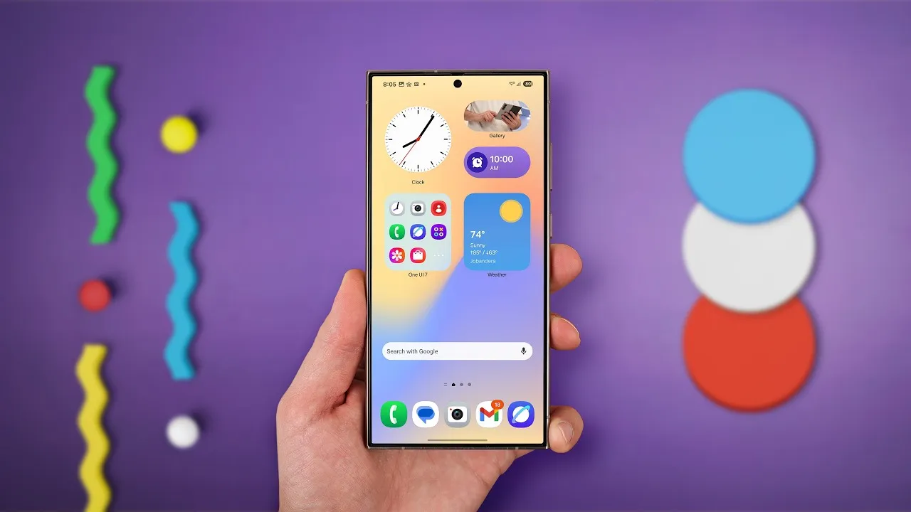
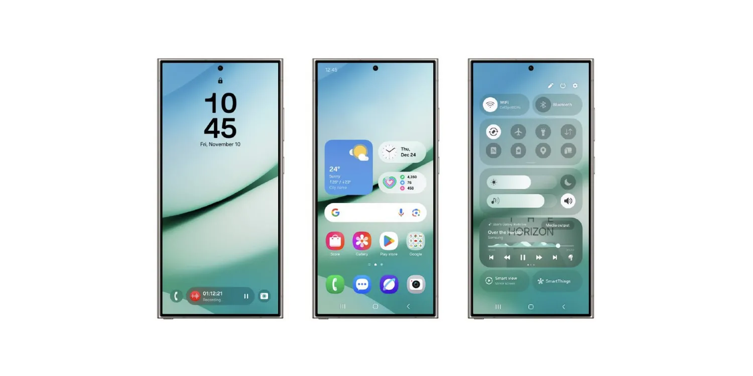
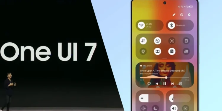
Samsung’s One UI 7 has reshaped the aesthetic of its interface with bold, refreshing changes. The updated stock app icons now boast more vibrant colors and sophisticated gradient backgrounds, aiming to invigorate the user experience with a modern touch. Alongside these cosmetic updates, the Quick Panel has been revamped for extensive customization, making it more user-friendly and adaptable to individual needs. Moreover, notifications have transitioned to a sleek pill shape, enhancing the overall visual harmony of the interface.

The Controversial Watermark: Aesthetic Intrusion or Necessary Reminder?
Positioned in the bottom right corner of the app drawer, the watermark appears over app icons as users scroll vertically, an alteration from the previous horizontal scrolling mechanism. This change not only affects the aesthetic flow of the UI but also raises questions about its necessity. “Maybe the apps you install on a Galaxy phone are secured by Knox, but it is an unnecessary label for regular users,” as noted in the comparative analysis between One UI 7.0 and its predecessor, One UI 6.1.1.
The rationale behind Samsung’s decision to display the Knox security logo constantly within the app drawer remains unclear. While it serves as a reminder of the security features protecting the device, many see it as a visual clutter that undermines the user interface’s clean and streamlined appearance. This is particularly irksome because there seems to be no option to disable or hide this watermark, forcing users to accept this permanent addition to their daily visual experience on their device.

Balancing Innovation with User Preferences
As Samsung continues to push the boundaries of what’s possible with smartphone technology and user interface design, the feedback from One UI 7 illustrates a critical balance that needs to be struck between introducing innovative features and respecting user preferences. The new design elements and functionalities are generally well-received, but the imposition of permanent, non-customizable elements like the “Secured by Knox” watermark can detract from the overall user experience.

In conclusion, while One UI 7.0 marks a significant step forward in many areas for Samsung, it also serves as a reminder that innovation must be tempered with consideration for user experience. Users looking for a seamless and aesthetically pleasing interface might find the watermark a minor yet persistent annoyance, overshadowing the many advancements that One UI 7 brings to Samsung devices. As the tech giant moves forward, one hopes that future updates will allow more flexibility in customization, letting users decide what elements they want to see on their screens.


