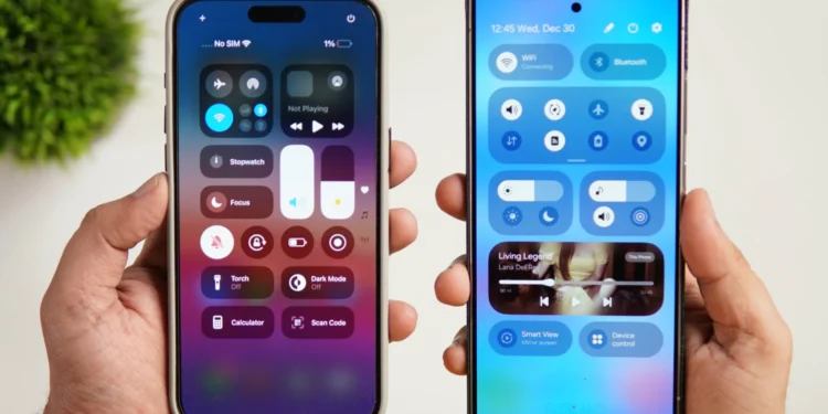
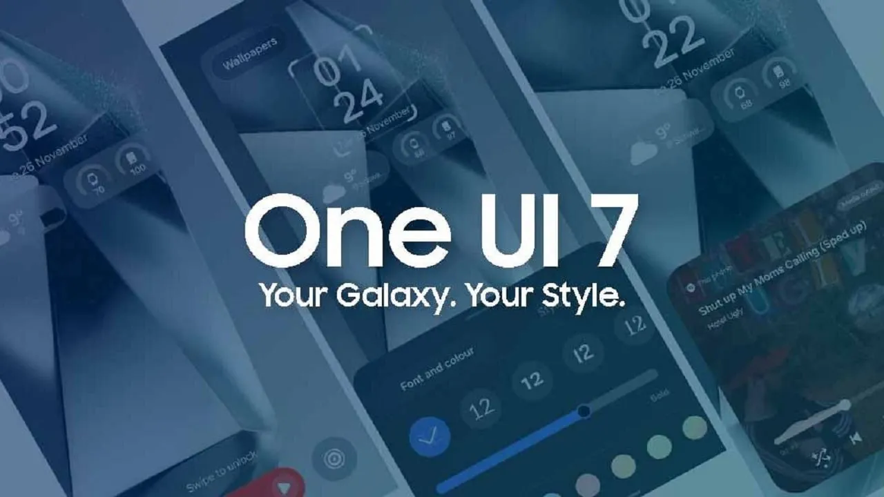
Samsung’s latest software update, One UI 7, has been making headlines not just for its features but also for its striking resemblance to Apple’s iOS. The update, which is based on Android 15, showcases a variety of enhancements that seem to draw heavy inspiration from recent iOS updates. Let’s delve into the specifics of how Samsung’s newest update mirrors Apple’s design and functionality, and what this means for users.
The Evolution of User Interface: Samsung Embraces iOS Features
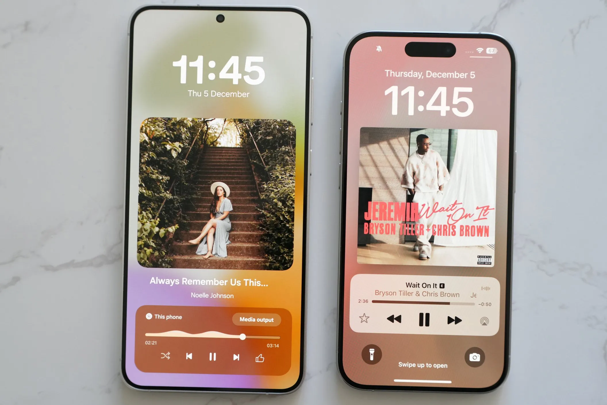
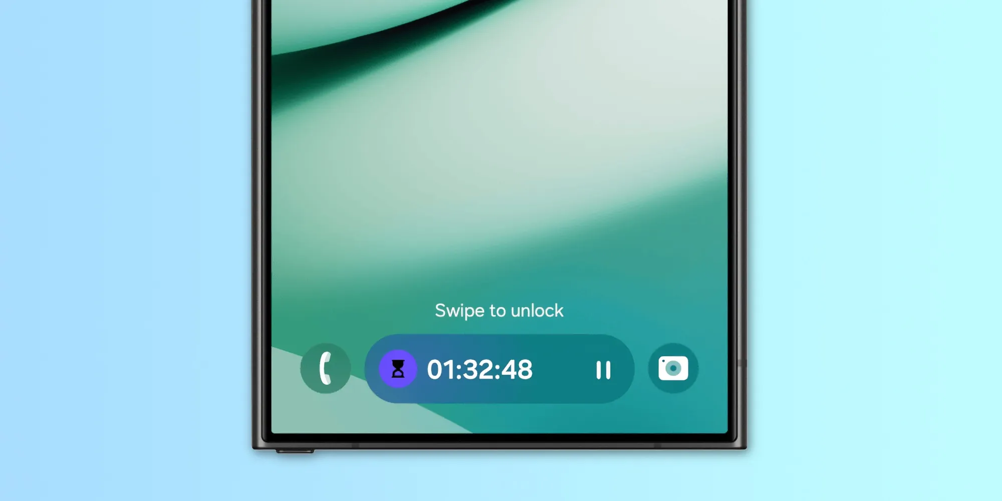
One of the most talked-about features of One UI 7 is the introduction of the “Now Bar” and “Live Notifications,” which are reminiscent of iOS’s Dynamic Island. Samsung has integrated these features into its lockscreen and status bar to display ongoing tasks such as timers, music, and more. However, unlike iOS, Samsung’s implementation currently lacks integration with third-party apps, which may limit its usefulness.
Home Screen Customization: A Nod to iOS Flexibility
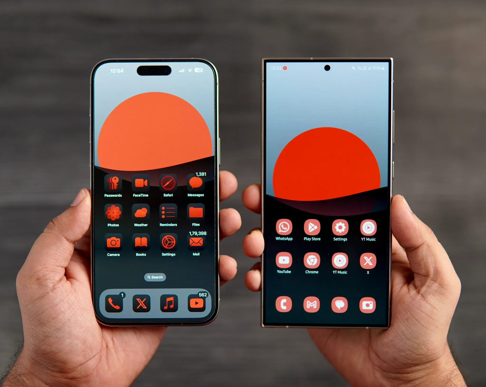
Samsung has also revamped its approach to home screen customization, a change likely influenced by iOS 18. In an effort to offer a more tailored and streamlined user experience, Samsung now allows users to adjust the size of app icons and toggle the display of app names, just as Apple does. Additionally, Samsung users can now add names to widgets, enhancing the overall aesthetic and functionality of their home screens.
Multitasking and Notifications: Borrowing from iOS’s Playbook
Another area where Samsung has borrowed from iOS is in the redesign of the multitasking page. The new layout in One UI 7 is nearly identical to that of iOS, providing a familiar experience to users who might switch between the two platforms. Furthermore, Samsung has adopted a separate notification tray and Quick Settings, similar to the split design found in iOS. This modification offers a more organized interface, allowing users to access notifications and settings more intuitively.
Visual Updates and Iconography: Following Apple’s Lead
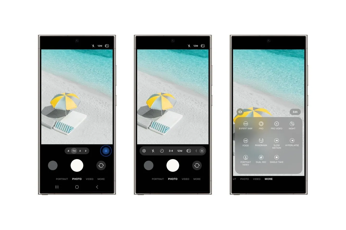
In terms of visual design, Samsung has introduced a new battery icon that mirrors the one found in recent iOS versions, complete with a green charging animation that activates when the device is plugged in. This subtle change not only aligns Samsung’s aesthetic more closely with that of Apple but also enhances the visual feedback for battery status.
What Does This Mean for Samsung Users?
For Samsung users, these changes mean a more intuitive and refined user experience that aligns with some of the best elements found in iOS. However, it also raises questions about the uniqueness of Samsung’s user interface design. As Samsung continues to incorporate elements that are distinctly iOS-like, it may diminish the brand’s individuality in the smartphone market.
While it’s clear that Samsung’s One UI 7 update has significantly closed the gap between Android and iOS in terms of user interface and functionality, it remains to be seen whether these changes will be received as genuine innovations or mere imitations. What is undeniable, however, is that both platforms are continually evolving, often by adopting and refining the successful features of one another.
Samsung’s strategy to integrate iOS-like features could be seen as an attempt to attract users who appreciate iOS’s interface but prefer the flexibility of Android. As the mobile technology landscape continues to evolve, this blending of features might well represent a new era of convergence between the two dominant operating systems in the market.

