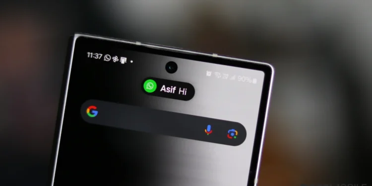
In the fast-paced world of technology, major players like Apple, Google, and Samsung are constantly on the lookout for the next big innovation to enhance user experience. This continuous exchange of ideas has led to some of the most intuitive user interface designs seen in smartphones today. Notably, Apple’s introduction of Dynamic Island with the iPhone 14 has set a new benchmark for notification management, influencing competitors to rethink their approach.
Google’s Leap Towards Dynamic Island-Like Notifications with Android 16
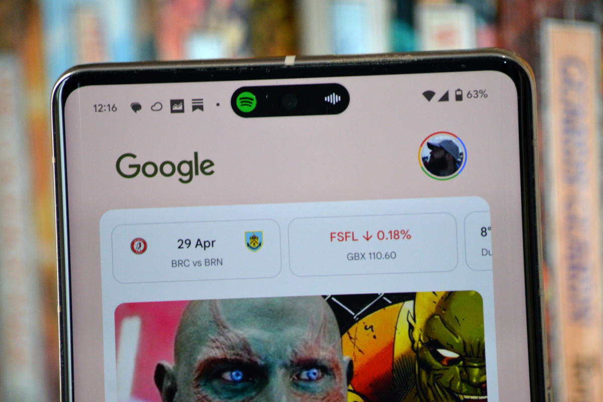
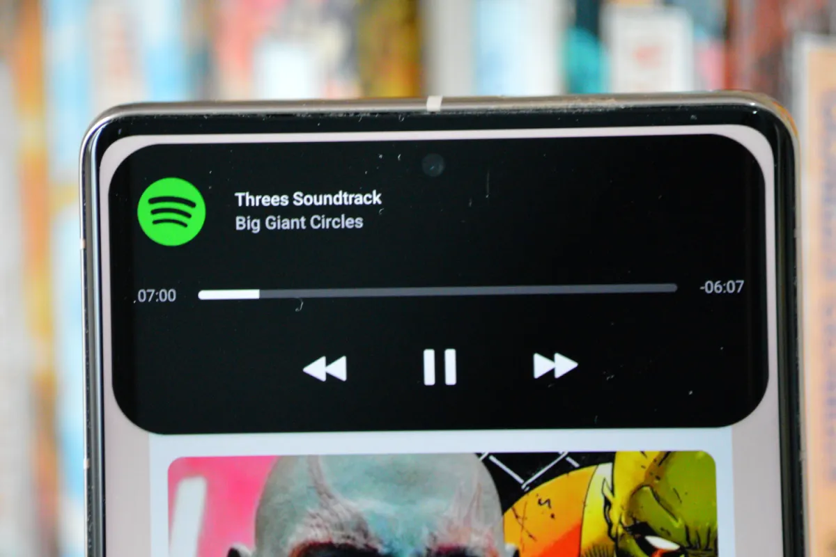
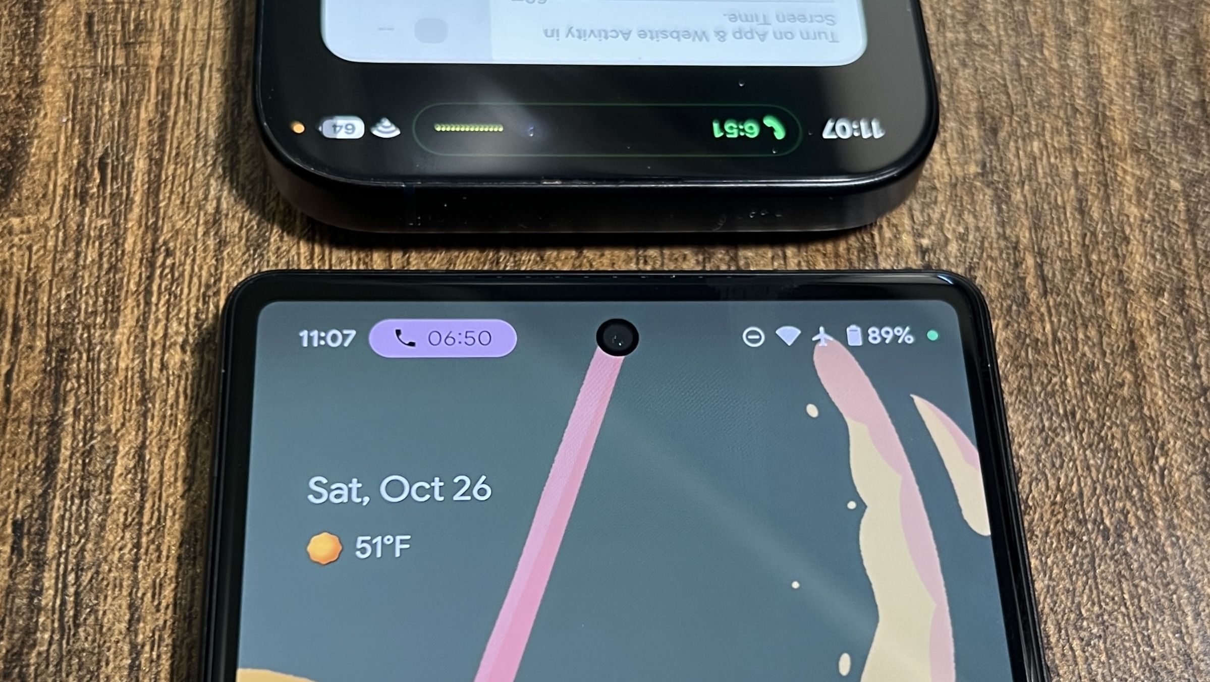
Google, known for refining its notification system with each Android iteration, is reportedly gearing up to take a significant leap with Android 16. A recent delve by Android Authority into Google’s ongoing developments revealed a new API dubbed Rich Ongoing Notifications being tested in Android 15 QPR1 Beta 3. This innovative feature aims to bring pill-shaped notification chips to the status bar, capable of displaying app icons, custom backgrounds, and relevant information like text and time.
These developments suggest a shift towards more interactive and less intrusive notifications, enhancing the overall usability of Android devices. Mishaal Rahman, an esteemed tech analyst, provided insights with mockups generated using the command-line interface. These mockups showcase how various apps, such as cab services and airlines, could seamlessly integrate this feature to display real-time updates on user activities.
A Glimpse into Samsung’s Adaptations and the Broader Impact
Samsung isn’t far behind in this race. The Korean tech giant has already incorporated similar features in its One UI 7.0, where ongoing activities are elegantly displayed as pill-shaped rich notifications on the status bar. This functionality is particularly useful for displaying persistent information such as active calls or timers without overwhelming the user.
The Potential of Rich Ongoing Notifications in Android 16
The introduction of Rich Ongoing Notifications in Android 16 could revolutionize how users interact with their devices. By adopting a Dynamic Island-like model, Google can offer Android users a more refined and engaging way to receive notifications. This would not only cater to the aesthetic appeal sought by modern users but also enhance functionality by making interactions more intuitive and less disruptive.
What This Means for App Developers and Android Users
For app developers, the opening up of this API means more creative freedom and the ability to offer richer, more engaging user experiences. Android users, on the other hand, have long expressed their desire for Dynamic Island-style notifications. With Google’s potential move, their calls may finally be answered, marking a significant enhancement in the Android ecosystem that could rival Apple’s user interface ingenuity.
The ongoing development of Android’s notification system underscores a broader trend in smartphone UI design: the emphasis on seamless, user-centric innovations. As these tech titans continue to borrow and refine each other’s ideas, they not only enhance their products but also drive the industry forward, promising ever-more sophisticated and intuitive user experiences.

