Apple Inc. stands as a colossus in the tech world, its logo instantly recognizable across the globe. Yet, the origins and the true meaning behind the iconic bitten apple logo remain a subject of intrigue and speculation for many. This emblem, embodying simplicity and innovation, carries a history that might surprise even the most ardent fans of the brand. Today, we delve into the fascinating backstory that transformed a simple fruit into a symbol of technological revolution.

Apple: The Genesis of an Icon
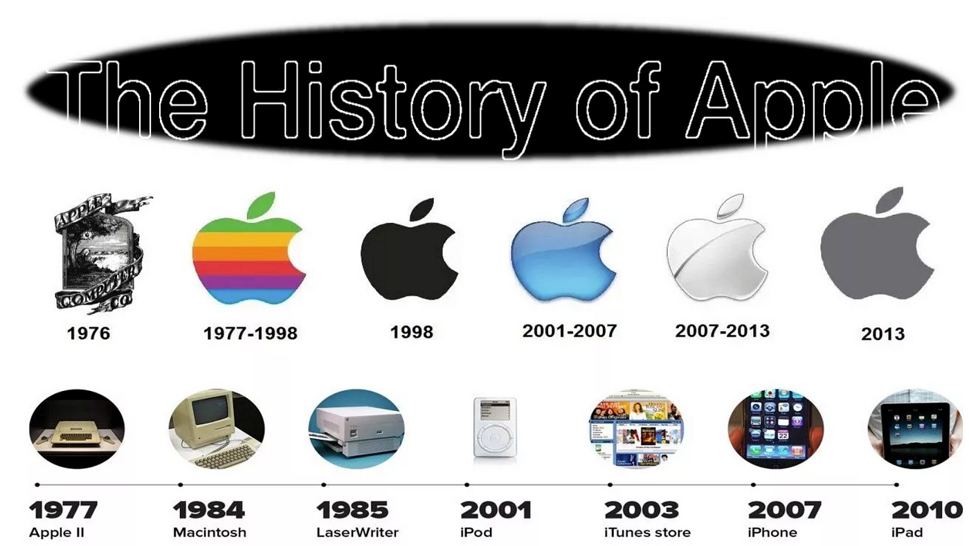
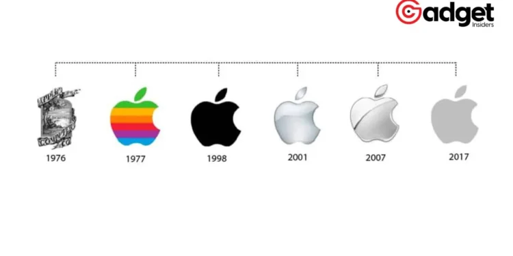
The journey of the tech giant’s logo began in 1977, a pivotal year when the then-nascent company aimed to carve its niche in the burgeoning computer technology market. Initially, Apple’s representation was a complex illustration featuring Sir Isaac Newton sitting under an apple tree.
However, this detailed imagery was far from practical for branding purposes, especially when it came to the small scales required for product placement.
Enter Rob Janoff, a graphic designer tasked with the challenge by none other than Steve Jobs, with a directive that was succinct yet profound: “Don’t make it cute.” The aim was clear – to create a logo that was simple, memorable, and unmistakably Apple. Janoff’s approach was to eschew the prevailing trend of typographic logos, opting instead for the pure and simple form of an apple.
Do you know the origin of the Apple logo?🧐 https://t.co/2wqgOkEgsw
— Ben Magelsen 🇺🇸 (@benmagelsen) August 17, 2022
A Design Evolution
Janoff presented a silhouette of an apple, complete with a leaf, a design that exuded simplicity and elegance. Yet, this initial design encountered an unexpected hurdle – it was frequently mistaken for a cherry.
The solution? A distinctive bite was taken out of the apple, clarifying its identity and adding a layer of uniqueness to the design.
This bite, however, has been the center of much speculation. Some theories suggest it was a nod to the computing term “byte,” while others believe it references the biblical tale of Adam and Eve. Despite these interpretations, Janoff clarifies that the bite was primarily a practical design choice, with any wordplay being a mere coincidence.
Beyond the Bite: A Symbol of Innovation
With the addition of colorful stripes, the logo not only underscored the tech giant’s capacity to display color images but also heralded a new era of computing. This design would become synonymous with Apple throughout the 1980s, a beacon of innovation and quality in the tech industry.
The story of the logo, as recounted by the YouTube channel Apple Explained, reveals the blend of practicality and creativity that has defined the brand.
Far from being a mere aesthetic choice, the bitten apple symbolizes the company’s commitment to clarity, simplicity, and forward-thinking. It’s a testament to the company’s origins, its journey through innovation, and its unwavering focus on the user experience.

Final Thoughts
In the realm of technology and innovation, logos serve as more than just branding tools; they are emblems of philosophy and vision. Apple’s logo, with its humble origins and deep-seated symbolism, is a reminder of the company’s journey from a small startup to a global powerhouse.
It stands as a beacon of innovation, challenging us to look beyond the surface and appreciate the profound stories embedded in the simplest of designs.


